Branding. Website. Photography. Video.
Sky Zone
Progressing the brand of one of the nation’s premier franchises.

Founded in 2004, Sky Zone Indoor Trampoline Parks created an entirely new category of location-based entertainment. Over a decade later, Sky Zone had opened over 150 franchise locations and expanded into new countries. But as the business matured, so too did the competition; imitators began springing up left and right, feeding off of Sky Zone’s rapid success. It became increasingly clear that a change was in order if Sky Zone was going to keep its position as category leader.
We were tasked with determining the viability of—and ultimately executing on—a brand positioning that could appeal to new customers without alienating the existing core audience, thus growing the customer base and driving long-term growth.
CLIENT
Sky Zone
Year
2016-2017
AGency
HYFN
Role
Creative Direction, Design, Animation
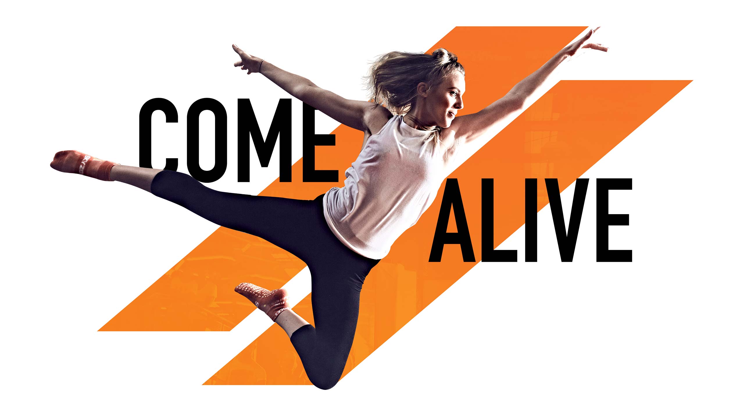
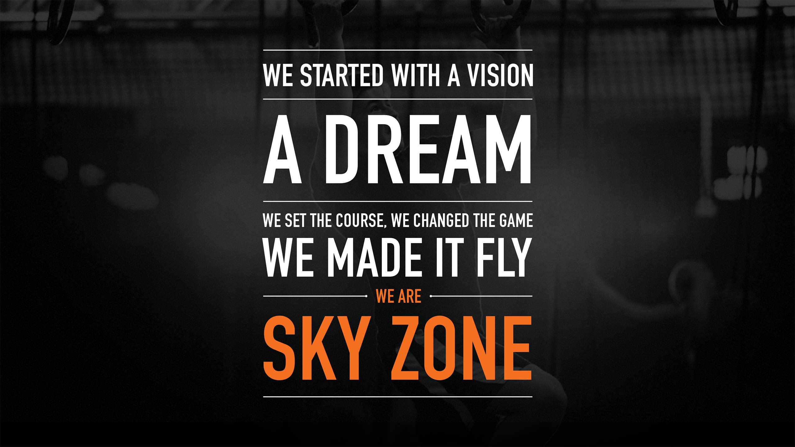
We developed brand pillars that could define the experience as it currently exists while providing a foundation for the brand moving forward. We then crafted a positioning statement that could unite all the brand pillars, appeal to our expanded audience, differentiate from competition, and serve as a north star to guide the company and our creative executions.
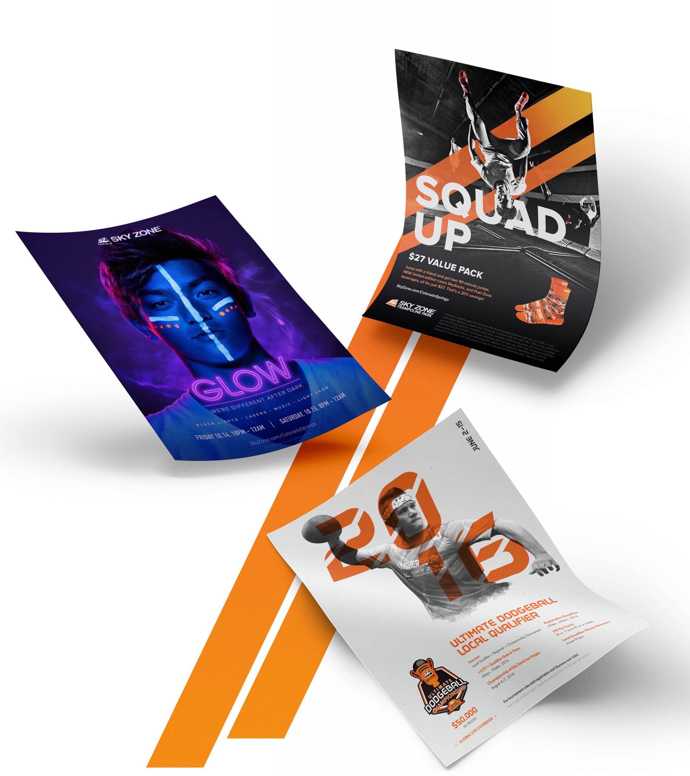
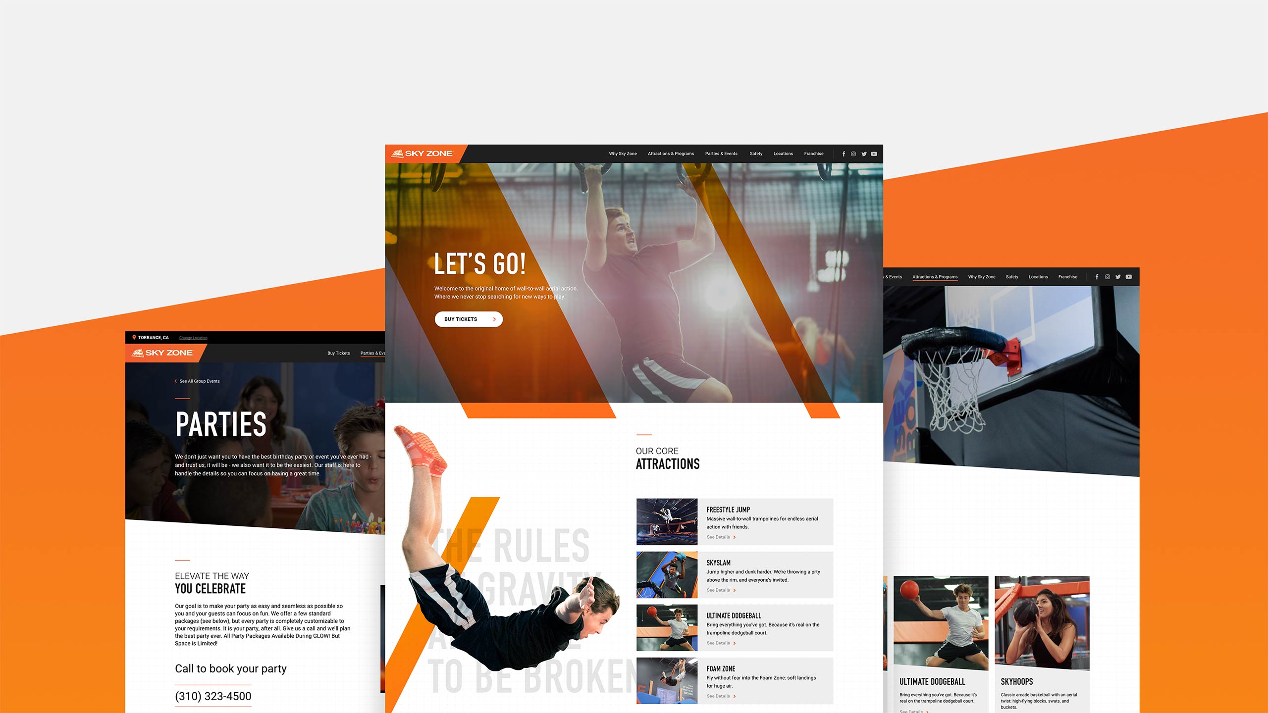
Our visual approach centered on three key principles: motion, moments, and owning orange—an existing, yet underutilized brand color. The brand voice is meant to extend the visual approach by being active, engaging, inclusive, impactful, and aspirational.

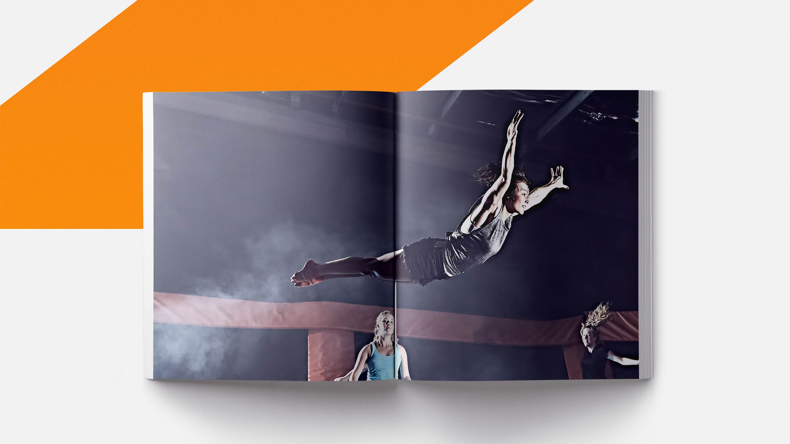
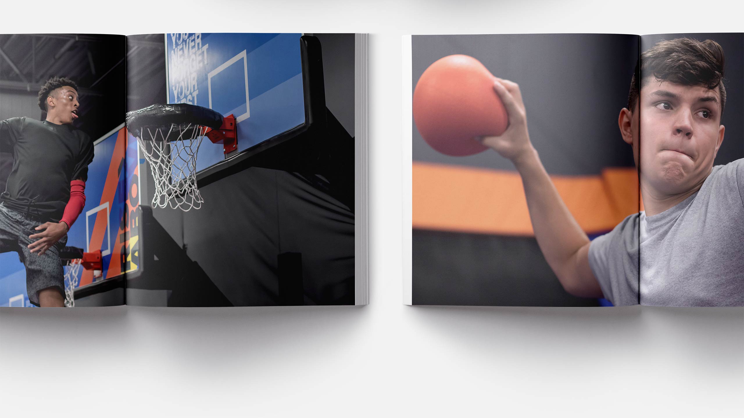
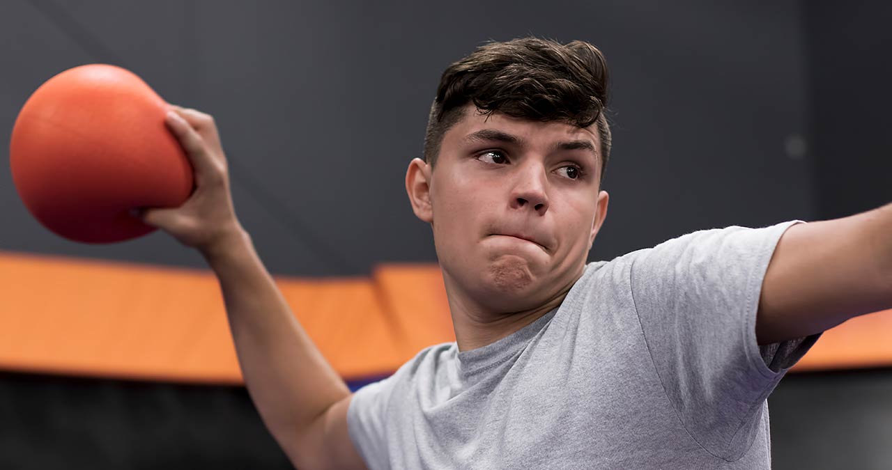
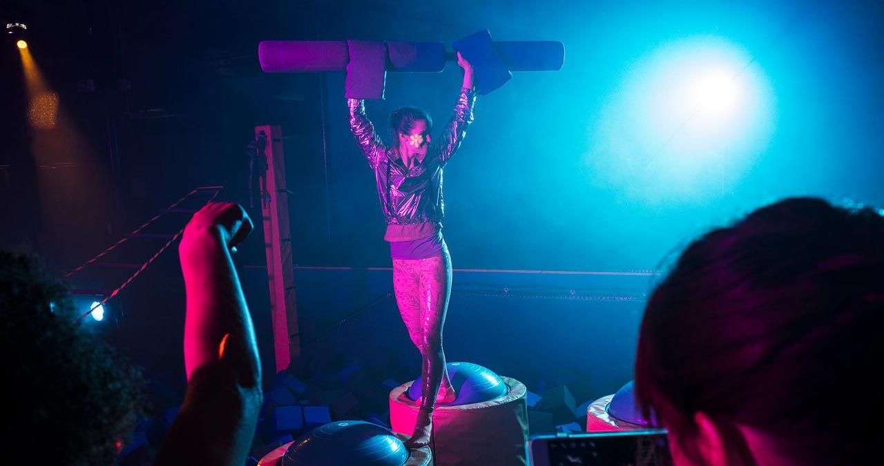
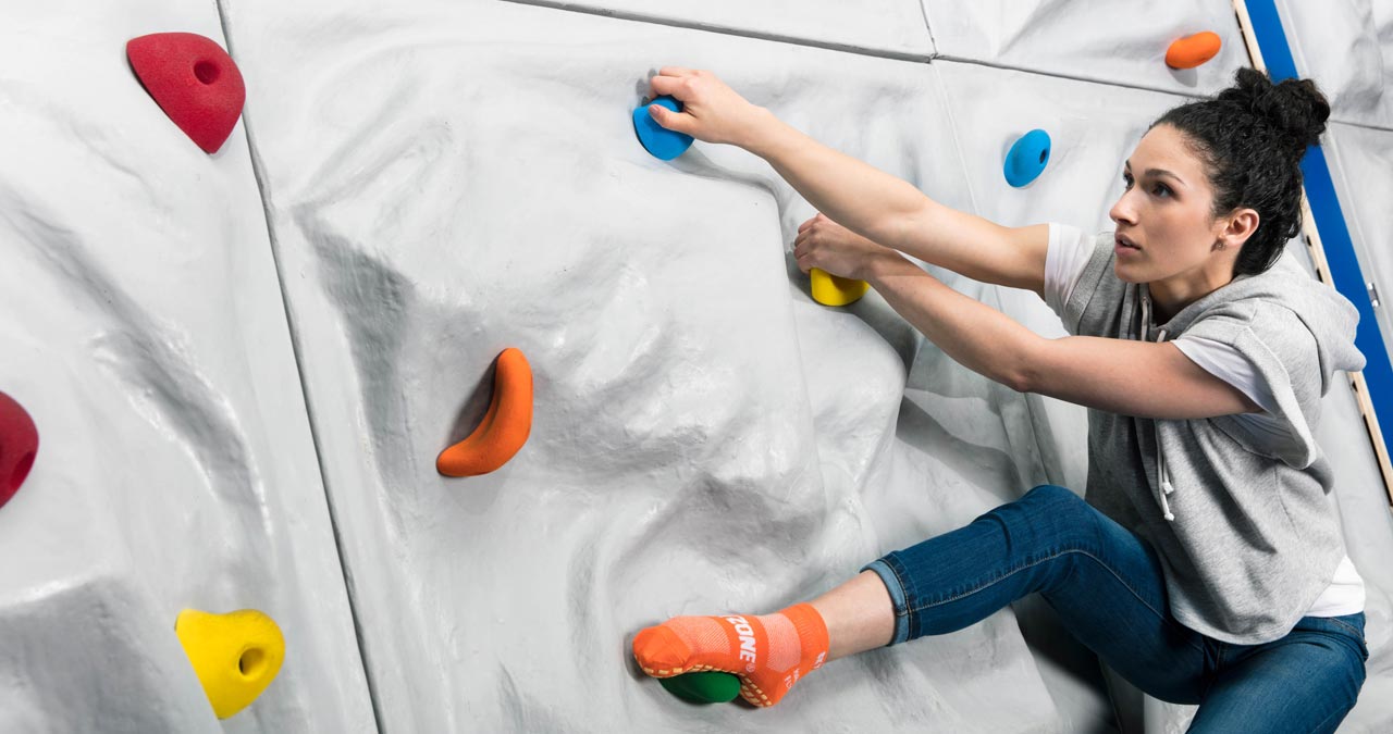
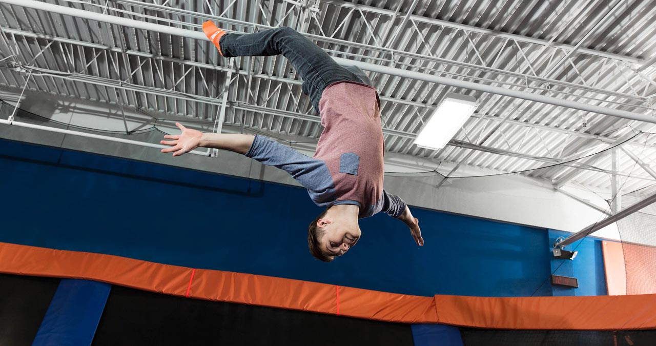
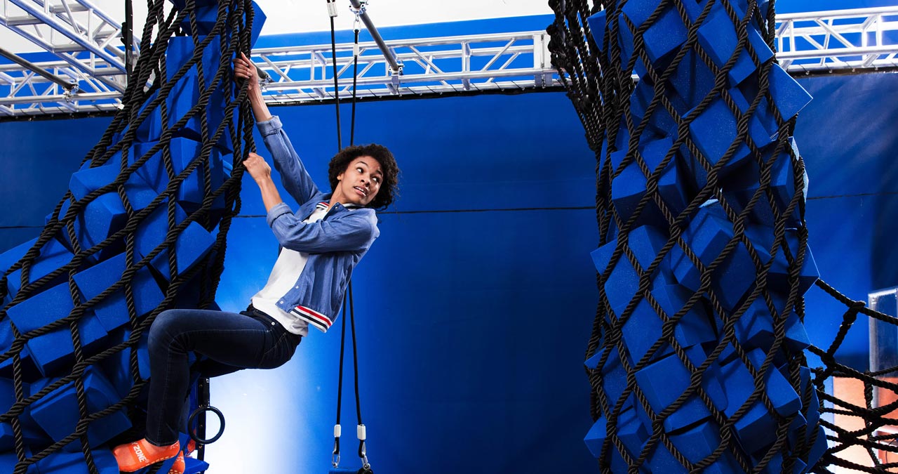
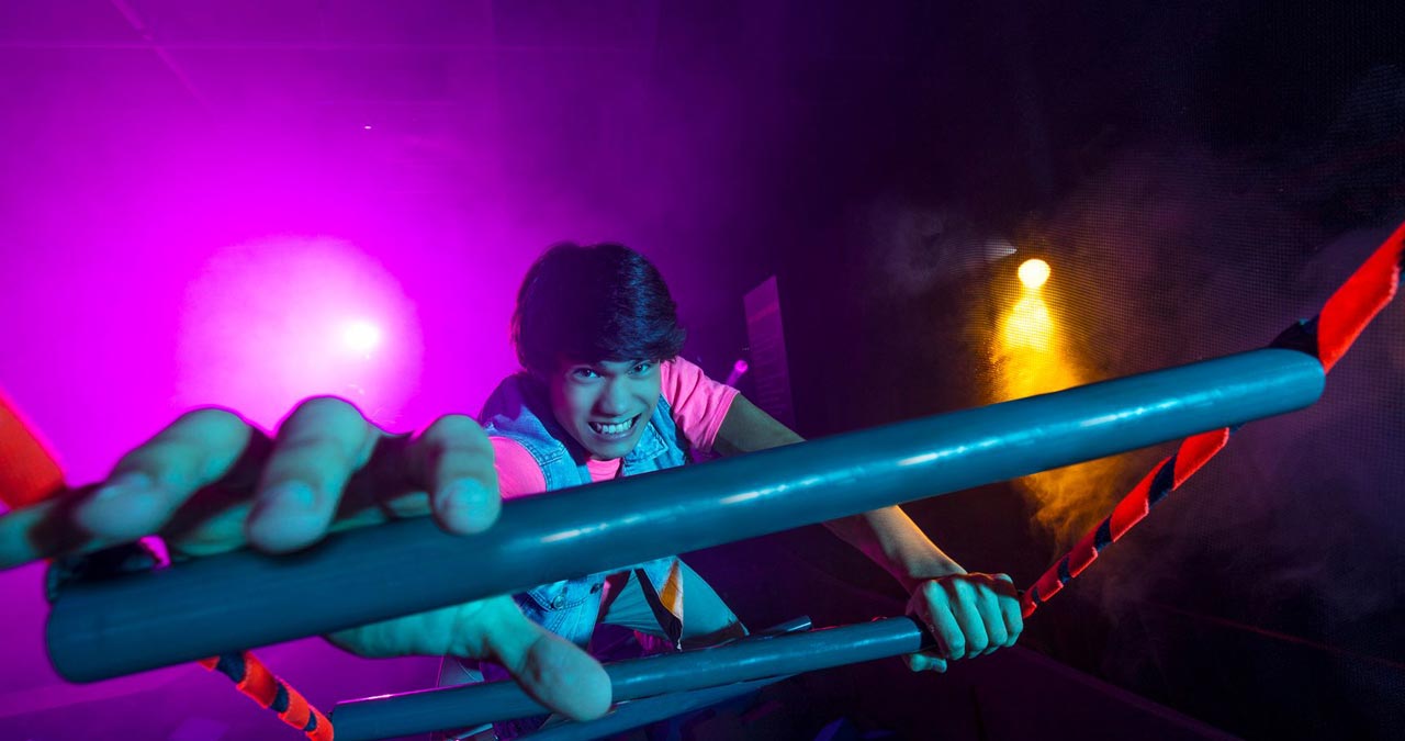
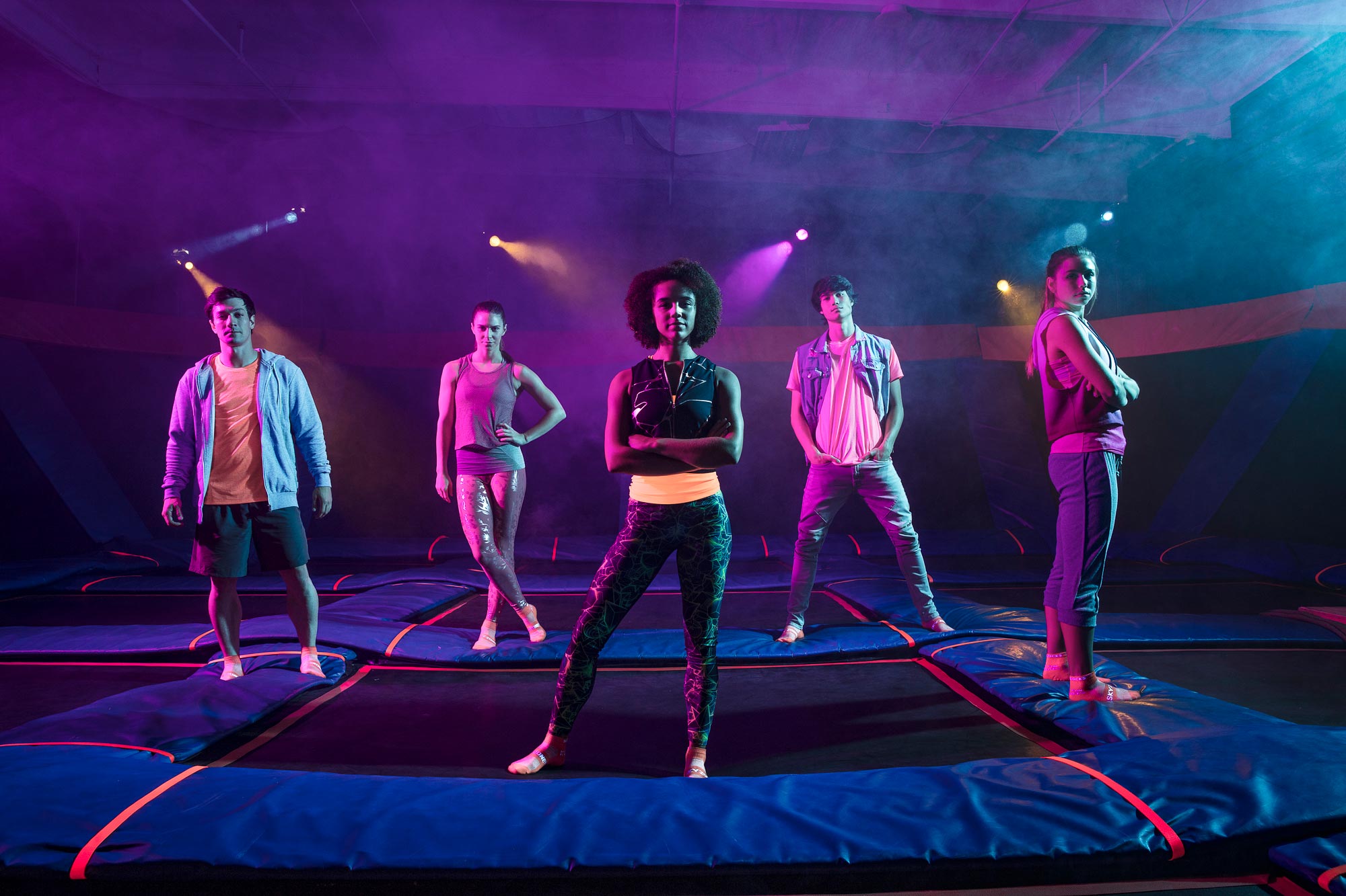
A large multi-day production drove the development of all-new brand assets: action photography and video, website and social content, green screen footage, and more. We created a new brand spot, as well as videos for popular attractions and programs to be used in web and social. All video was focused on bringing the experience and feeling of a day at Sky Zone to the forefront: Music had an athletic drumline feel, edits are energetic, intercut with key slow-motion focus on the moments where jumpers are living in the moment, and the overall tone of the executions were more mature, competitive, and dramatic.
We also held various supporting shoots and created graphics to bring some of the new brand flavor to the existing content calendar while we continued to plan for the launch of the full brand evolution.
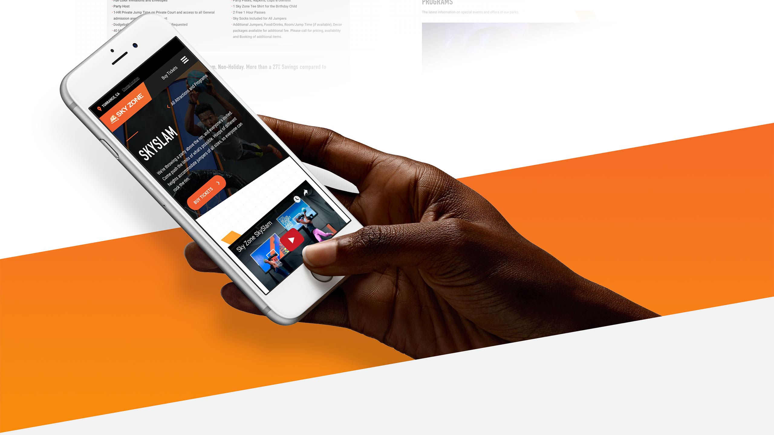
Franchise businesses present a unique challenge when it comes to web design. Not only did we have to bring forth a design language that would communicate the new positioning, we also had to develop capabilities that would allow 150+ individual parks—all with different hours, prices, attractions, and park-specific imagery—to keep their pages accurate and up to date while avoiding inconsistencies, slow load times, or complications to the user experience. Graphical complexity and expectations for high traffic lead us to a development approach of serving content out of cache, allowing us to keep load times and infrastructure needs minimal.
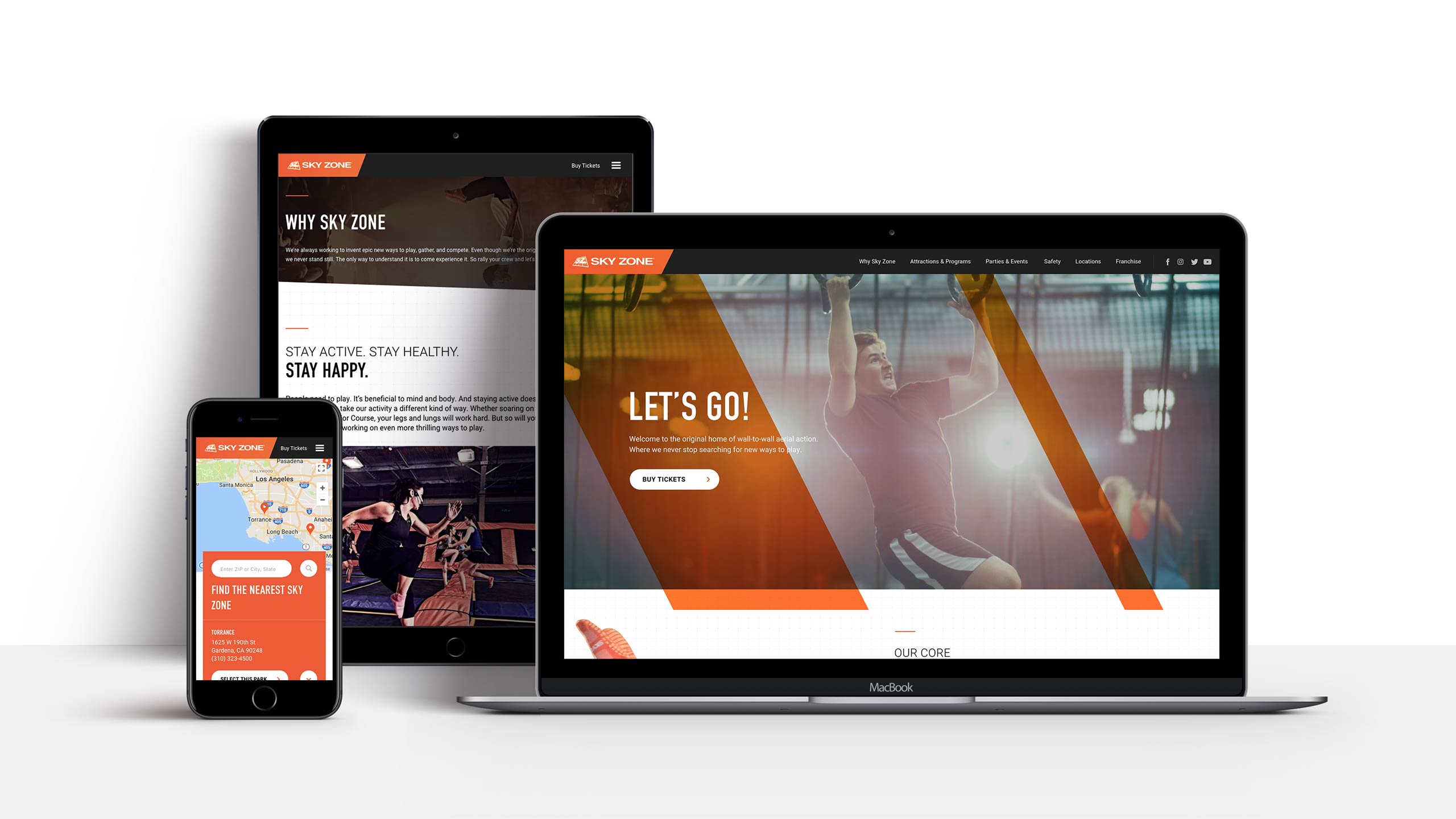

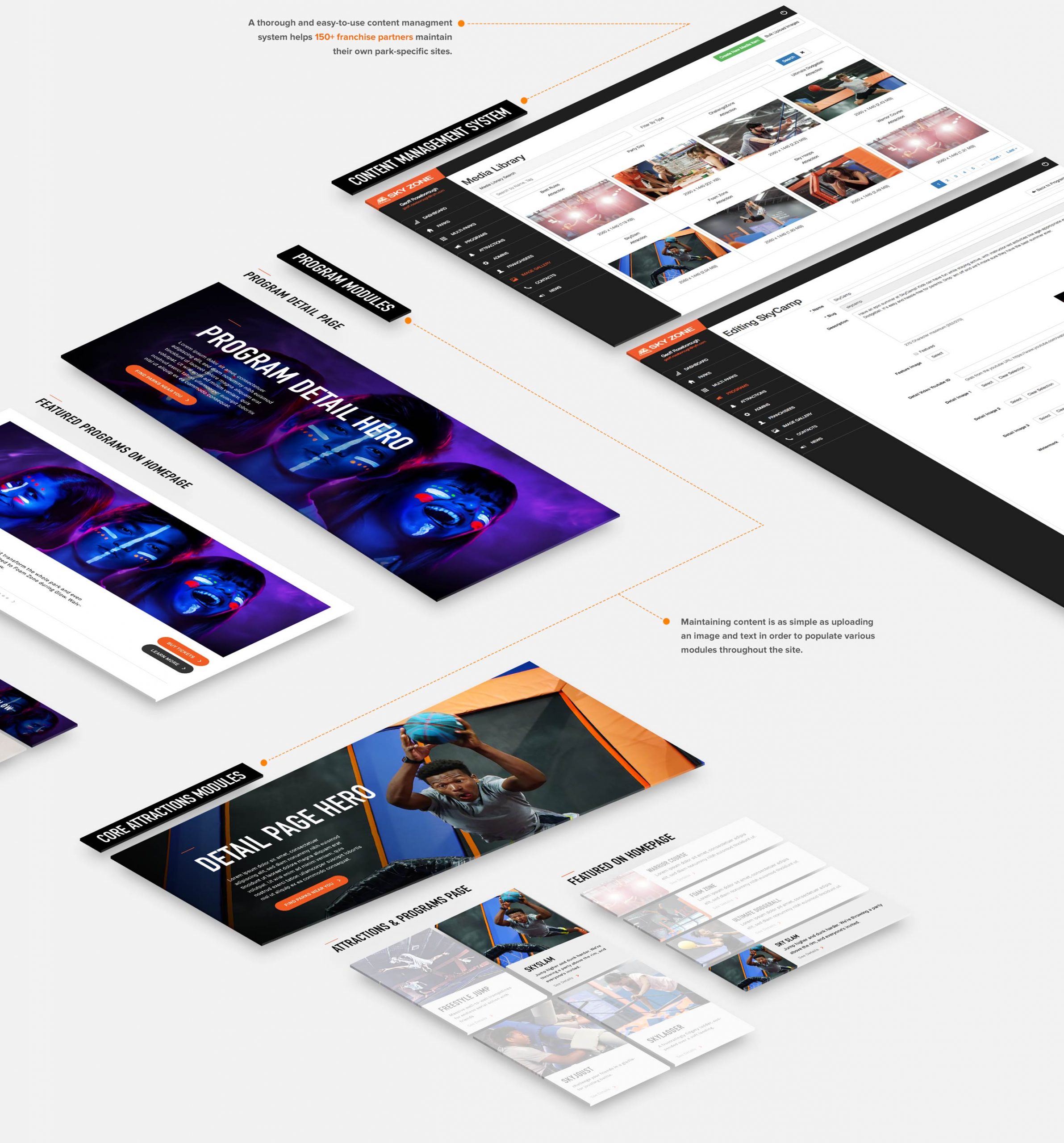
Perhaps the largest technological challenge was designing and developing a custom CMS in a way that mirrors the organizational structure of the franchise business—allowing individual franchise owners to control and edit crucial information regarding their parks in a way that keeps the content fully integrated into the design and experience of the site. This information then had to be packaged and put forth on other relevant sections of the site, such as the park locator so that users know exactly what’s available to them at their local park.
CREATIVE DIRECTION
Scott Mallone, Nick Boes
COPY & STRATEGY LEAD
Jonathan Miller
ART DIRECTION
Brett Beynon
DESIGN
Geoff Roseborough
Photography
Kevin Winzeler, Geoff Roseborough
CLIENT PARTNERSHIP
Peter Pouliopoulos
CLIENT SERVICES
Love Steams, Brie Aseltine
DEVELOPMENT LEAD
Daniel Leavitt
DEVELOPMENT
Scott Wilson, Owen Masback, Tom Krenzke, Melanie Windh
DEVELOPMENT
Paragon Creative
